
效果图:

1.自定义组件 bw-swiper.vue 代码:
<template>
<view class=”swiperContent”>
<swiper
@change=”change”
@animationfinish=”animationfinish”
:indicator-dots=”indicatorDots”
:indicator-active-color=”indicatorActiveColor”
:indicator-color=”indicatorColor”
:current=”current”
:interval=”interval”
:duration=”duration”
:circular=”circular”
:vertical=”vertical”
:previous-margin=”previousMargin”
:next-margin=”nextMargin”
:display-multiple-items=”displayMultipleItems”
:skip-hidden-item-layout=”skipHiddenItemLayout”
:autoplay=”(autoplay && flag)”
:style=”{‘height’:swiperHeight+’px’}”
:class=”(swiperType && displayMultipleItems ==1 && !vertical && !fullScreen)?’cardSwiper’:” “
class=”screen-swiper”
>
<swiper-item class=”swiper-item” v-for=”(item,index) in swiperList” :key=”index” :class=”(cardCur==index && displayMultipleItems ==1 && !vertical && !fullScreen)?’cur’:”” @tap=”clickItem(index)”>
<view v-if=”item[imageKey] && !item[videoKey]”>
<image :src=”item[imageKey]” :style=”{‘height’:swiperHeight+’px’}”></image>
<text v-if=”textTip” class=”swiperText” :style=”{
‘bottom’:(swiperType?(textStyleBottom+12):textStyleBottom)+’%’,
‘right’:textStyleRight+’%’,
‘color’:textStyleColor,
‘background’:textStyleBgcolor,
‘font-size’:upxtopx(textStyleSize)
}”>{{item[textKey]}}</text>
</view>
<view v-if=”item[videoKey]”>
<video :src=”item[videoKey]” @play=”play” @pause=”pause” :style=”{‘height’:swiperHeight+’px’}” autoplay loop muted :autoplay=”videoAutoplay” objectFit=”cover”></video>
</view>
</swiper-item>
<swiper-item class=”swiper-item” v-if=”swiperList.length==0″ >
<text></text>
</swiper-item>
</swiper>
</view>
</template>
<script>
export default {
name:’bw-swiper’,
created:function(){
var that = this;
if(this.fullScreen){
uni.getSystemInfo({
success:function(e){
that.swiperHeight = e.screenHeight -44
}})
}
},
mounted:function(){
if(!this.fullScreen){
const query = uni.createSelectorQuery().in(this);
query.select(‘.swiper-item’).boundingClientRect(data => {
if(!!data){
this.swiperHeight = data.width/this.w_h;
}
}).exec();
}
},
props: {
fullScreen:{ // 是否全屏
type:Boolean,
default:false
},
swiperList:{ // 滑块视图容器数据
type:Array,
required: true,
default:function(){
return []
}
},
swiperType:{ // false => 全屏限高轮播图 true => 卡塔式轮播图
type:Boolean,
default:false
},
videoAutoplay:{ // true =>video 自动播放
type:Boolean,
default:false
},
videoKey:{ // 视频映射的键
type:String,
default:’src’
},
imageKey:{ // 图片映射的键
type:String,
default:’img’
},
textKey:{ // 文字说明映射的键
type:String,
default:’text’
},
textTip:{ // 图片文字说明 false => 隐藏
type:Boolean,
default:false
},
textStyleSize:{ // 图片文字大小
type:Number,
default:24
},
textStyleBottom:{ // 图片文字位置
type:Number,
default:5
},
textStyleRight:{ // 图片文字位置
type:Number,
default:5
},
textStyleColor:{ // 图片文字颜色
type:String,
default:’#ffffff’
},
textStyleBgcolor:{ // 图片文字背景色
type:String,
default:’transparent’
},
w_h:{ //宽高比 推荐 w/h => 2
type:Number,
default:2
},
skipHiddenItemLayout:{ //是否跳过未显示的滑块布局,设为 true 可优化复杂情况下的滑动性能,但会丢失隐藏状态滑块的布局信息
type:Boolean,
default:false
},
displayMultipleItems:{ //同时显示的滑块数量
type:Number,
default:1
},
nextMargin:{ // 后边距,可用于露出后一项的一小部分,接受 px 和 rpx 值 头条小程序不支持
type:String,
default:’0px’
},
previousMargin:{//前边距,可用于露出前一项的一小部分,接受 px 和 rpx 值头条小程序不支持
type:String,
default:’0px’
},
vertical:{ //滑动方向是否为纵向 卡牌 不支持纵向以及同时显示的2块以上滑块数量
type:Boolean,
default:false
},
circular:{ // 是否采用衔接滑动
type:Boolean,
default:true
},
duration:{ // 滑动动画时长
type:Number,
default:400
},
interval:{ // 自动切换时间间隔
type:Number,
default:2500
},
current:{ // 当前所在滑块的 index
type:Number,
default:0
},
autoplay:{ // 是否自动切换–轮播
type:Boolean,
default:false
},
indicatorColor:{ // 指示点颜色
type:String,
default:’#CCCCCC’
},
indicatorActiveColor: { // 当前选中的指示点颜色
type: String,
default: ‘#ffffff’
},
indicatorDots: { // 是否显示面板指示点
type: Boolean,
default: true
}
},
data() {
return {
flag:true,
cardCur:0,
swiperHeight:300
}
},
computed:{
},
methods: {
upxtopx:function(size){
// #ifdef MP-WEIXIN
return uni.upx2px(size)+’px’
// #endif
// #ifndef MP-WEIXIN
return size+’upx’;
// #endif
},
play:function(){
this.flag = false
},
pause:function(){
this.flag = true
},
clickItem:function(index){
if(this.swiperList.length>0){
this.$emit(‘clickItem’,this.swiperList[index])
}
},
change:function(e){
this.$emit(‘change’,e)
},
animationfinish:function(e){
this.cardCur = e.detail.current;
this.$emit(‘animationfinish’,e)
}
}
}
</script>
<style>
.cardSwiper .swiper-item{
width:86%!important;
overflow: initial;
}
.cardSwiper .swiper-item view{
width: 100%;
display: block;
height: 100%;
border-radius: 10upx;
transform: scale(0.9,0.8);
opacity: 0.7;
transition: all 0.1s ease-in 0s;
overflow: hidden;
box-sizing: border-box;
margin-left:8.1%;
}
.cardSwiper .cur view{
transform: initial;
opacity: 1;
transition: all 0.1s ease-in 0s;
}
.swiper-item view{
height:100%;
width:100%;
position: relative;
}
.swiperText{
position: absolute;
color:#ffffff;
z-index:2;
border-radius: 4upx;
padding:0 4upx;
}
.screen-swiper image{
width:100%;
}
.screen-swiper video,
.swiper-item video {
width: 100%;
display: block;
height: 100%;
}
.swiperContent{
width:100%;
}
</style>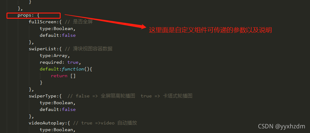
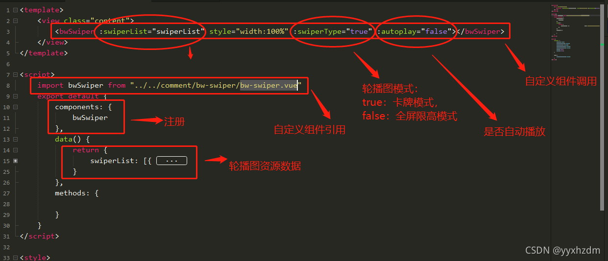
2.自定义组件的调用:
代码:
<template>
<view class=”content”>
<bwSwiper :swiperList=”swiperList” style=”width:100%” :swiperType=”true” :autoplay=”false”></bwSwiper>
</view>
</template>
<script>
import bwSwiper from “../../comment/bw-swiper/bw-swiper.vue”
export default {
components: {
bwSwiper
},
data() {
return {
swiperList: [{
img: ‘https://ossweb-img.qq.com/images/lol/web201310/skin/big25011.jpg’
},
{
img: ‘https://ossweb-img.qq.com/images/lol/web201310/skin/big25011.jpg’
},
{
img: ‘https://ossweb-img.qq.com/images/lol/web201310/skin/big25011.jpg’
}
]
}
},
methods: {
}
}
</script>
<style>
.content {
display: flex;
flex-direction: column;
align-items: center;
justify-content: center;
background-color: white;
width: 100%;
height: 100%;
}
page {
background-color: white;
}
</style>
说明:
资源Demo https://download.csdn.net/download/yyxhzdm/26321747?spm=1001.2014.3001.5503
版权声明:本文内容由互联网用户自发贡献,该文观点仅代表作者本人。本站仅提供信息存储空间服务,不拥有所有权,不承担相关法律责任。如发现本站有涉嫌侵权/违法违规的内容, 请发送邮件至 举报,一经查实,本站将立刻删除。
文章由极客之音整理,本文链接:https://www.bmabk.com/index.php/post/119131.html

