
一、圣杯布局、双飞翼布局简单介绍
圣杯布局、双飞翼布局基本都是一致的,都是两边固定宽度,中间自适应的三栏布局。
中间栏要放到文档流前面,保证先行渲染。
圣杯布局、双飞翼布局都是三栏(左中右)全部float:left浮动,区别在于中间栏div是否被遮挡上
圣杯布局:中间栏相对定位,配合left、right属性,三栏独立分开
双飞翼布局:中间栏嵌套div,内容写在嵌套的div中,嵌套div设置margin-left/margin-right。左右栏在中间栏的上面
区别:双飞翼布局中间栏不变,将内容部分为两边腾开位置;圣杯布局是中间栏为两边腾开位置。
二、双飞翼布局
双飞翼布局是在middle里面嵌套一个div,通过调整内部div的margin值实现自适应
从盒子模型知道,不能直接给middle添加margin属性,因为已经设置了width:100%,再给margin会超过窗口的宽度,所以需要嵌套一个内容层div,将要显示的内容放入其中,然后设置margin。
<!DOCTYPE html>
<html lang="en">

<head>
    <meta charset="UTF-8">
    <title>双飞翼布局</title>
    <style>
        #header {
            height: 50px;
            background-color: aquamarine;
            text-align: center;
        }

        #middle {
            float: left;
            width: 100%;
            /*左边栏上去到第一行*/
            height: 100px;
            background-color: rgb(246, 153, 153);
        }

        #left {
            float: left;
            width: 180px;
            height: 100px;
            margin-left: -100%;
            background-color: rgb(155, 130, 205);
        }

        #right {
            float: left;
            width: 200px;
            height: 100px;
            margin-left: -200px;
            background-color: rgb(210, 75, 192);
        }

        #inseide {
            margin: 0 200px 0 180px;
            height: 100px;
        }

        #footer {
            clear: both;
            /*清除浮动*/
            height: 50px;
            background-color: pink;
            text-align: center;
        }
    </style>
</head>

<body>
    <div id="header">header</div>
    <div id="middle">
        <div id="inside">middle</div>
    </div>
    <div id="left">left</div>
    <div id="right">right</div>
    <div id="footer">footer</div>
</body>

</html>
<script>

</script>
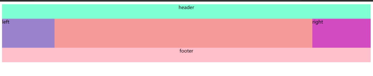
三、圣杯布局
<!DOCTYPE html>
<html lang="en">

<head>
    <meta charset="UTF-8">
    <title>圣杯布局</title>
    <style>
        #header {
            height: 50px;
            background-color: rgb(211, 141, 141);
            text-align: center;
        }

        #bd {
            padding: 0 200px 0 180px;
            height: 100px;
        }

        #middle {
            float: left;
            width: 100%;/*占满窗口,才有自适应的效果*/
            height: 100px;
            background-color: rgb(121, 121, 186);
        }

        #left {
            float: left;
            width: 180px;
            height: 100px;
            margin-left: -100%;
            /*left放到middle的左边,margin的百分比相对父元素,所以需要整整一行的宽度才能补偿这个margin的值*/
            background-color: rgb(97, 179, 159);
            position: relative;
            left: -180px;
        }

        #right {
            float: left;
            width: 200px;
            height: 100px;
            margin-left: -200px;
            /*margin-left设置的值为负的right的宽,正好middle重叠rihgt的宽度,加上浮动,right就到middle的右边*/
            background-color: rgb(157, 85, 188);
            position: relative;
            right: -200px;
        }

        #footer {
            height: 50px;
            background-color: rgb(228, 12, 184);
            text-align: center;
        }
    </style>
</head>

<body>
    <div id="header">header</div>
    <div id="bd">
        <div id="middle">middle</div>
        <div id="left">left</div>
        <div id="right">right</div>
    </div>
    <div id="footer">footer</div>
</body>
</body>

</html>
<script>

</script>
四、知识点复习
圣杯布局和双飞翼布局都用到了margin负值,以及float浮动,涉及到了文档流的概念,复习一下知识点。
(1)文档流
在页面布局中,自上而下一行行(块级元素),从左到右按顺序排放元素(行内元素),就是文档流
定位类型包括三种:块级元素的块级格式、行内元素的行内格式、以及块级元素行内元素的相对定位方式
(2)脱离文档流
元素脱离文档流有两种方式:①float:left/right ②position:absolute/fixed
float:left/right脱离文档流但是不会脱离文本流,什么意思呢?就是其他盒子元素会无视这个元素,但是其他盒子内的文本依然会为它让出位置,环绕在其周围。
(3)float布局规则
- 如果浮动元素的上一个元素也是浮动元素,那么该元素与上一个元素排列同一行。如果行宽不够怎么办?后面的元素挤占到下一行。
- 如果浮动元素的上一个元素不是浮动元素,那么该元素仍在上一个元素的下方,根据浮动在左/右。本身脱离普通文档流,后面的元素会自动往上移动到上一个普通流元素的下方。
- 给元素设置float后,元素形成了“块”,可以给元素设置宽with和高height。
五、margin取负值的用法及意义
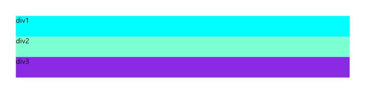
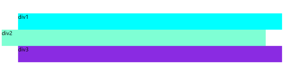
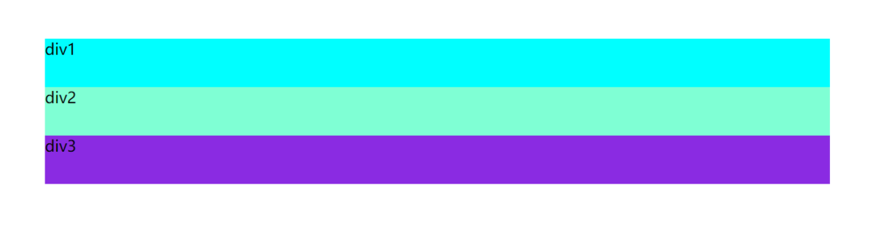
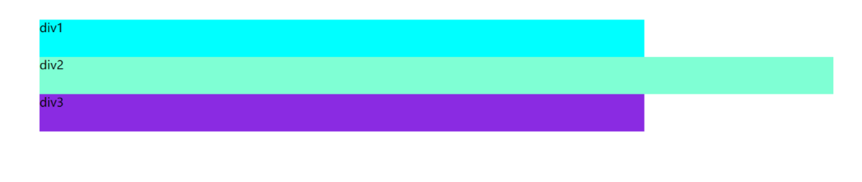
(1)普通文档流margin取负值
- margin-left为负值,影响自身元素
<!DOCTYPE html>
<html lang="en">

<head>
    <meta charset="UTF-8">
    <title></title>
    <style>
        #box {
            padding: 50px;
            width: 80%;
            height: 150px;
        }

        #div1 {
            background-color: aqua;
            width: 80%;
            height: 50px;
        }

        #div2 {
            background-color: aquamarine;
            width: 80%;
            height: 50px;
        }

        #div3 {
            background-color: blueviolet;
            width: 80%;
            height: 50px;
        }
    </style>
</head>

<body>
    <div id="box">
        <div id="div1">div1</div>
        <div id="div2">div2</div>
        <div id="div3">div3</div>
    </div>
</body>

</html>
<script>

</script>
<!DOCTYPE html>
<html lang="en">

<head>
    <meta charset="UTF-8">
    <title></title>
    <style>
        #box {
            padding: 50px;
            width: 80%;
            height: 150px;
        }

        #div1 {
            background-color: aqua;
            width: 80%;
            height: 50px;
        }

        #div2 {
            background-color: aquamarine;
            width: 80%;
            height: 50px;
            margin-left: -50px;
            /*margin-left为负值,影响自身元素*/
        }

        #div3 {
            background-color: blueviolet;
            width: 80%;
            height: 50px;
        }
    </style>
</head>

<body>
    <div id="box">
        <div id="div1">div1</div>
        <div id="div2">div2</div>
        <div id="div3">div3</div>
    </div>
</body>

</html>
<script>

</script>
-
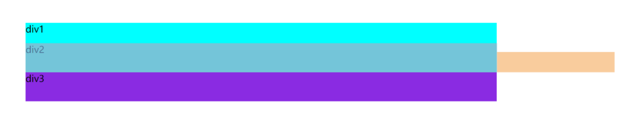
margin-right为负值
当设置宽度时,无影响
<!DOCTYPE html>
<html lang="en">

<head>
    <meta charset="UTF-8">
    <title></title>
    <style>
        #box {
            padding: 50px;
            width: 80%;
            height: 150px;
        }

        #div1 {
            background-color: aqua;
            width: 80%;
            height: 50px;
        }

        #div2 {
            background-color: aquamarine;
            width: 80%;
            height: 50px;
            margin-right: -50px;
            /*margin-right为负值,设置宽度,无影响*/
        }

        #div3 {
            background-color: blueviolet;
            width: 80%;
            height: 50px;
        }
    </style>
</head>

<body>
    <div id="box">
        <div id="div1">div1</div>
        <div id="div2">div2</div>
        <div id="div3">div3</div>
    </div>
</body>

</html>
<script>

</script>
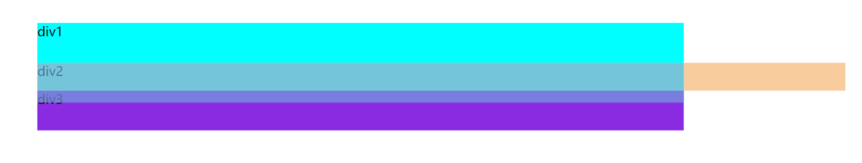
当不设置宽度时,有影响
<!DOCTYPE html>
<html lang="en">

<head>
    <meta charset="UTF-8">
    <title></title>
    <style>
        #box {
            padding: 50px;
            width: 80%;
            height: 150px;
        }

        #div1 {
            background-color: aqua;
            width: 80%;
            height: 50px;
        }

        #div2 {
            background-color: aquamarine;
            height: 50px;
            margin-right: -50px;
            /*margin-right为负值,不设置宽度*/
        }

        #div3 {
            background-color: blueviolet;
            width: 80%;
            height: 50px;
        }
    </style>
</head>

<body>
    <div id="box">
        <div id="div1">div1</div>
        <div id="div2">div2</div>
        <div id="div3">div3</div>
    </div>
</body>

</html>
<script>

</script>
- margin-top为负值
偏移相对自身而言,在后面的元素受影响
<!DOCTYPE html>
<html lang="en">

<head>
    <meta charset="UTF-8">
    <title></title>
    <style>
        #box {
            padding: 50px;
            width: 80%;
            height: 150px;
        }

        #div1 {
            background-color: aqua;
            width: 80%;
            height: 50px;
        }

        #div2 {
            background-color: aquamarine;
            height: 50px;
            width: 80%;
            margin-top: -15px;
            /*margin-top为负值,元素相对自身偏移,其后面的元素受影响*/
        }

        #div3 {
            background-color: blueviolet;
            width: 80%;
            height: 50px;
        }
    </style>
</head>

<body>
    <div id="box">
        <div id="div1">div1</div>
        <div id="div2">div2</div>
        <div id="div3">div3</div>
    </div>
</body>

</html>
<script>

</script>
- margin-bottom为负值
自身没有偏移量,其后面的元素向上偏移
<!DOCTYPE html>
<html lang="en">

<head>
    <meta charset="UTF-8">
    <title></title>
    <style>
        #box {
            padding: 50px;
            width: 80%;
            height: 150px;
        }

        #div1 {
            background-color: aqua;
            width: 80%;
            height: 50px;
        }

        #div2 {
            background-color: aquamarine;
            height: 50px;
            width: 80%;
            margin-bottom: -15px;
            /*margin-bottom为负值,元素自身无偏移,其后面的元素向上偏移*/
        }

        #div3 {
            background-color: blueviolet;
            width: 80%;
            height: 50px;
        }
    </style>
</head>

<body>
    <div id="box">
        <div id="div1">div1</div>
        <div id="div2">div2</div>
        <div id="div3">div3</div>
    </div>
</body>

</html>
<script>

</script>
总结
①margin-left/margin-right影响自身元素偏移,向指定的方向偏移
②margin-right在没有设置宽度的时候,宽度向右增加对应的px
③margin-bottom影响后面的元素,使后面的元素向上偏移
所有偏移的元素位于z轴的上方,偏移量覆盖正常元素的对应位置
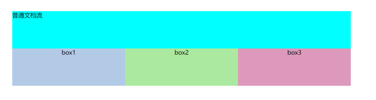
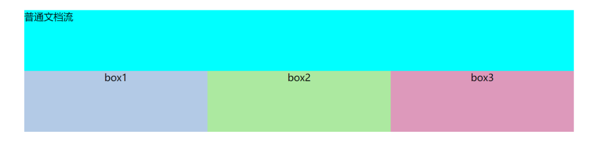
(2)浮动流margin去负值
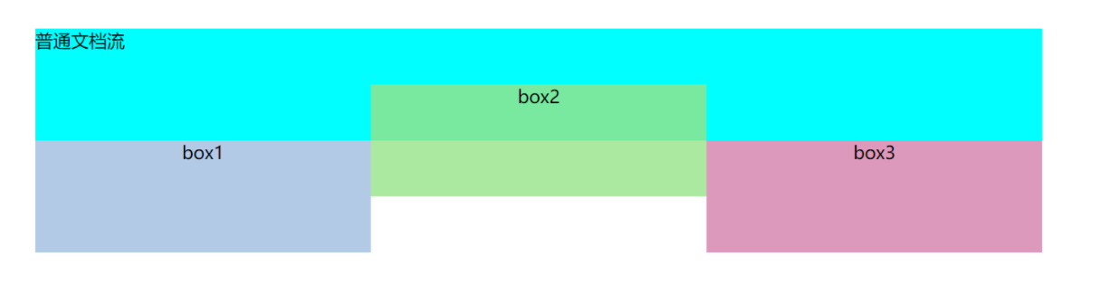
- margin-top为负值
影响自身元素,元素将向上偏移
<!DOCTYPE html>
<html lang="en">

<head>
    <meta charset="UTF-8">
    <title></title>
    <style>
        .putong {
            margin-left: 50px;
            margin-top: 50px;
            width: 900px;
            height: 100px;
            background-color: aqua;
        }

        .flb {
            float: left;
            width: 300px;
            height: 100px;
            text-align: center;
        }

        .flbox1 {
            margin-left: 50px;
            background-color: rgba(160, 189, 224, 0.8);
        }

        .flbox2 {
            background-color: rgba(151, 227, 136, 0.8);
        }

        .flbox3 {
            background-color: rgba(213, 127, 170, 0.8);
        }
    </style>
</head>

<body>
    <div class="putong">普通文档流</div>
    <div class="container">
        <div class="flb flbox1">box1</div>
        <div class="flb flbox2">box2</div>
        <div class="flb flbox3">box3</div>
    </div>
</body>

</html>
<script>

</script>
</script>
<!DOCTYPE html>
<html lang="en">

<head>
    <meta charset="UTF-8">
    <title></title>
    <style>
        .putong {
            margin-left: 50px;
            margin-top: 50px;
            width: 900px;
            height: 100px;
            background-color: aqua;
        }

        .flb {
            float: left;
            width: 300px;
            height: 100px;
            text-align: center;
        }

        .flbox1 {
            margin-left: 50px;
            background-color: rgba(160, 189, 224, 0.8);
        }

        .flbox2 {
            background-color: rgba(151, 227, 136, 0.8);
            margin-top: -50px;
            /*margin-top为负值,影响自身元素,向上偏移*/
        }

        .flbox3 {
            background-color: rgba(213, 127, 170, 0.8);
        }
    </style>
</head>

<body>
    <div class="putong">普通文档流</div>
    <div class="container">
        <div class="flb flbox1">box1</div>
        <div class="flb flbox2">box2</div>
        <div class="flb flbox3">box3</div>
    </div>
</body>

</html>
<script>

</script>
</script>
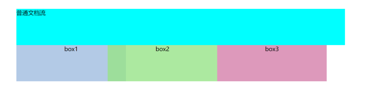
- margin-left为负值
影响自身元素,向左偏移,并且影响后面的元素
<!DOCTYPE html>
<html lang="en">

<head>
    <meta charset="UTF-8">
    <title></title>
    <style>
        .putong {
            margin-left: 50px;
            margin-top: 50px;
            width: 900px;
            height: 100px;
            background-color: aqua;
        }

        .flb {
            float: left;
            width: 300px;
            height: 100px;
            text-align: center;
        }

        .flbox1 {
            margin-left: 50px;
            background-color: rgba(160, 189, 224, 0.8);
        }

        .flbox2 {
            background-color: rgba(151, 227, 136, 0.8);
            margin-left: -50px;
            /*margin-left为负值,影响自身元素,向左偏移,并且影响后面的元素*/
        }

        .flbox3 {
            background-color: rgba(213, 127, 170, 0.8);
        }
    </style>
</head>

<body>
    <div class="putong">普通文档流</div>
    <div class="container">
        <div class="flb flbox1">box1</div>
        <div class="flb flbox2">box2</div>
        <div class="flb flbox3">box3</div>
    </div>
</body>

</html>
<script>

</script>
</script>
若margin-left负值超过自身宽度
<!DOCTYPE html>
<html lang="en">

<head>
    <meta charset="UTF-8">
    <title></title>
    <style>
        .putong {
            margin-left: 50px;
            margin-top: 50px;
            width: 900px;
            height: 100px;
            background-color: aqua;
        }

        .flb {
            float: left;
            width: 300px;
            height: 100px;
            text-align: center;
        }

        .flbox1 {
            margin-left: 50px;
            background-color: rgba(160, 189, 224, 0.8);
        }

        .flbox2 {
            background-color: rgba(151, 227, 136, 0.8);
            margin-left: -340px;
            /*margin-left为负值,且超过自身宽度*/
        }

        .flbox3 {
            background-color: rgba(213, 127, 170, 0.8);
        }
    </style>
</head>

<body>
    <div class="putong">普通文档流</div>
    <div class="container">
        <div class="flb flbox1">box1</div>
        <div class="flb flbox2">box2</div>
        <div class="flb flbox3">box3</div>
    </div>
</body>

</html>
<script>

</script>
</script>

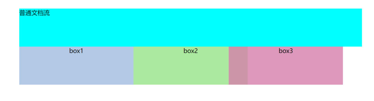
- margin-right为负值
自身无影响,影响其后面的元素,后面的元素向左偏移
<!DOCTYPE html>
<html lang="en">

<head>
    <meta charset="UTF-8">
    <title></title>
    <style>
        .putong {
            margin-left: 50px;
            margin-top: 50px;
            width: 900px;
            height: 100px;
            background-color: aqua;
        }

        .flb {
            float: left;
            width: 300px;
            height: 100px;
            text-align: center;
        }

        .flbox1 {
            margin-left: 50px;
            background-color: rgba(160, 189, 224, 0.8);
        }

        .flbox2 {
            background-color: rgba(151, 227, 136, 0.8);
            margin-right: -50px;
            /*margin-right为负值,自身无影响,影响其后面的元素,后面的元素向左偏移*/
        }

        .flbox3 {
            background-color: rgba(213, 127, 170, 0.8);
        }
    </style>
</head>

<body>
    <div class="putong">普通文档流</div>
    <div class="container">
        <div class="flb flbox1">box1</div>
        <div class="flb flbox2">box2</div>
        <div class="flb flbox3">box3</div>
    </div>
</body>

</html>
<script>

</script>
</script>
- margin-bottom为负值
没有影响
<!DOCTYPE html>
<html lang="en">

<head>
    <meta charset="UTF-8">
    <title></title>
    <style>
        .putong {
            margin-left: 50px;
            margin-top: 50px;
            width: 900px;
            height: 100px;
            background-color: aqua;
        }

        .flb {
            float: left;
            width: 300px;
            height: 100px;
            text-align: center;
        }

        .flbox1 {
            margin-left: 50px;
            background-color: rgba(160, 189, 224, 0.8);
        }

        .flbox2 {
            background-color: rgba(151, 227, 136, 0.8);
            margin-bottom: -50px;
            /*margin-bottom为负值,无影响*/
        }

        .flbox3 {
            background-color: rgba(213, 127, 170, 0.8);
        }
    </style>
</head>

<body>
    <div class="putong">普通文档流</div>
    <div class="container">
        <div class="flb flbox1">box1</div>
        <div class="flb flbox2">box2</div>
        <div class="flb flbox3">box3</div>
    </div>
</body>

</html>
<script>

</script>
</script>
总结
①margin-top影响自身元素,往对应的方向偏移
②margin-left影响自身元素,其后面的元素继续向左浮动,直到遇到浮动元素后固定
③margin-right不影响自身元素,影响后面的元素,后面的元素向对应的方向偏移
④margin-bottom无影响
版权声明:本文内容由互联网用户自发贡献,该文观点仅代表作者本人。本站仅提供信息存储空间服务,不拥有所有权,不承担相关法律责任。如发现本站有涉嫌侵权/违法违规的内容, 请发送邮件至 举报,一经查实,本站将立刻删除。
文章由极客之音整理,本文链接:https://www.bmabk.com/index.php/post/16130.html

